25 Apr 2019
Today we are bringing an interview very special to us: it is a big pleasure to talk again with a great artist as Luis NCT. Back in 2014, Luis was one of the very first artists that we interviewed in this blog, and as he recently published Wahcommo under the Astiberri publishing firm, we didn't pass the chance to talk with him and know everything about his new comic book first-hand.
Before talking about Wahcommo, tell us a bit about yourself. Who is Luis NCT?
I grew up by the Mediterranean sea, reading all kinds of comics and books, and spending a lot of time surrounded by art and printing machines. I began drawing comics as a kid and continued making fanzines on high school. I studied Fine Arts in Valencia after that, and wasted some time on musical matters and the illustration world. I'm trying to focus on Comic stuff nowadays, so I also work as colorist for USA while I make my own comic work.

Wahcommo is your second long work, after publishing "Sleeprs" with EDT. Where does this new story come from?
This comic book has its origin on a number of diverse interests. On one side, the most basic impulse was to do a color story of greater proportions (size and length), as contrast with Sleepers. I also wanted to do something on the epic fantasy genre, which I enjoyed so much as a reader (and role-playing gamer) during my kid, teenage, and post-teenage years.
On the other side, the fantasy genre served me as scaffolding to talk about social and historic evolution, providing more deep thoughts on what could seem a lighter story at first glance.
**The first thing that catches the eye is the large size the comic has, and of ocurse, the stunning visuals. Can you tell us about the process of illustration and coloring? How much did it takes to create one page of Wahcommo?
From the very moment the project was approved, I knew the final page size and format was going to be that. Because of the themes in the comic, I think the physical appearance of the comic book (the book as an object) completes the whole vibe I was looking for with the story. All the creation process was digital, from pencils to color, but it is made to be read on paper. I couldn't tell how much time each page took, and it also varies from page to page, but the whole project took me 4 years of work (I also worked on other projects during that time, too).
Some cool things about the process: I sometimes laid the first layer of color with a very low-detail sketch, and then used that color layer as base to create the clean drawing. I worked as this during the first half of the book, and on some landscapes. I also re-learned 3D on purpouse to solve some architecture issues. The typography to letter the pages was also done from scracth (as well as I could).

Talking about the story, the one thing that impressed us the most was how well "dosed" the plot and dialogues are, and that you tell a lot with very little. Wich are the things you want to talk about with this story?
In Wahcommo, I tried to combine two narratives: the one reflecting the character's drama, and the other exploring the themes that shape the story's world.
About the main characters, on one hand we got Fox, who struggles to fit the role his tribe expects him to play (and the traits that supossedly make a hero) although his true nature is not aligned with that. On the other side, Kaya fits perfectly on that role, but that is denied to her because being a woman, and she fights over that prejudice. Vanyan the warrior, for example, really represents what a true hero is, which is something very different from the glorious ideals that stories build around heroes.
About the more broader themes are not strictly tied to the characters that shape the world around them, they basically are the horror of war, the downfall and rise of civilizations, and how History misunderstoods (and a lot of time, re-writes) events to make them fit into a convenient narrative.
On the editorial side, how was working with Astiberri? How is the "industry" side of publishing a comic book like Wahcommo?
Astiberri are marvelous people. Actually, I already signed with them for a new comic-book with them, and working with them is a very pleasant experience. On the industry side, to create a story like this, where the author is in charge of everyting (except final graphic design on the cover and layout work, which Alba Diethelm did) is very different in deadlines and process than working on USA comics, where you are a part of a whole bigger team.
What did you discover and learn with this project and journey?
I found out that if I was able to make 200 full-color pages all by myself, I can do another 200 more, better and faster!
And last, but not least: What can we expect from Luis NCT on the next months?
I hope that a lot more comic-books! On May 2019 a 32-pages manga that I wrote and drawed is going to be published on Japan. It's a spin-off from Apollo's Song, by Osamu Tezuka, and will be publish on the Tezucomi magazine.
I'm already working on a sequel to Wahcommo. And I also would like to return to Slepeers before devoting my time to a longer project that's been a while in my mind.
Thanks a lot, Luis!
13 Mar 2019
Today, we want to let you know in our blog about Re-FREAM project. Re-FREAM is a european-funded project that aims to give artists and designers access to new production technology, new materials, and know-how to co-create innovative fashion concepts with scientists.
In three co-creation spaces (Valencia, Linz and Berlin) each of the 20 artists will receive 55.000€ of funding for co-creating innovative art concepts with scientists within a 9-month-period.
In the hubs, Re-Fream will provide access to different fields of expert technology and co-creation facilitation services, as well as network and knowledge opportunities to accelerate the selected projects from the call and help them grow.
The call for projects is already open and ends of next 30th of May. There are three challenges where projects can be submitted:
- From Analog to Connected (Berlin), focused on integration of electronics on textiles.
- From 2D to 3D (Linz), focused on 3D design and printing in fashion.
- From linear to sustainable circular systems (Valencia), focused on sustainability and reducing wastefulness and pollution.
An international jury will evaluate the artistic and technical content of these applications, paying close attention to the design, technological and business concepts, and professional background. You can find way more information about their evaluation criterias of the Re-Fream project in this PDF document, and a guide on how to apply and document your proposals in this other PDF document.
Hope you will find this interesting, and if you decide to submit a proposal: good luck!

07 Feb 2019
It has been a while since we did an interview in our blog, and it is time to fix that! To open the 2019 interview series, today we bring you Diego Lizán and María Moya, two illustrators who also have been subscribed to PRO Plan. María and Diego spent last year on an art residence that merges illustration, sculpture, and literature. We'll say no more, so you can find out more reading the interview. Enjoy!
Before talking about "Todo lo que sucede" (All that happens), let's talk a bit about you. Who are Diego Lizán and María Moya?
Diego Lizán: I'm a graphic designer, illustrator, and visual artist. My work flows from one discipline to the other. After working a lot of years on communication and graphic design, I'm focusing lately on illustration for children games and toys (with clientes like Djeco in France, or cartonLab), and on institutional communication. I love and have a great collection of toys and artoys; I'm very fond of ancient cultures and 50s-60s aesthetics. But my real passion is creating characters and imaginary worlds.
María Moya: I'm an illustrator focused on children books. Since 3 years ago, I've been also working on ceramics. Traditional techniques (materials and crafts) are my passion. In my illustrations you can always find a link with reality and nature, where I get inspiration from to create characters and environments. My worlds are full of tiny details which contain greats dosis of humor and tenderness.
"All that happens" has its origin on an art residence at Centro Puertas de Castilla Culture Center (Murcia). Could you tell us a bit more about the center, and how all this got started?
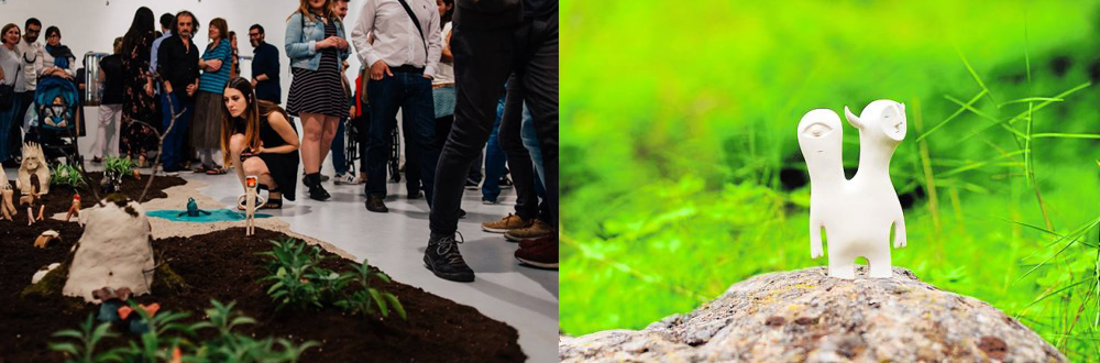
Puertas de Castilla Culture Center had a artist residence program where we took part in 2014 with other illustrators from our city (Murcia). The center, whose program is focused on comtemporary culture and art, and which regularly programs local and international artists, works, leaded by his director, to find new and different projects. We knew the center had a ceramic oven that was used in previous workshops, so we pitched project to them focused on character creation and moving from two to three dimensions. We called the project "Muñeco de Barro" (Mud Doll).
The process was all game and experimentation. We began trying to move the existing imaginarium from each of us to three dimensions, but as we progressed, everything transformed into the creation of a whole common world divided into 5 different landscapes. There was an expo with more than 200 pieces on Puertas de Castilla Center, which we called "All that happens between green and blue".
How was the experience and process of transforming illustration to a 3D ceramic sculpture?
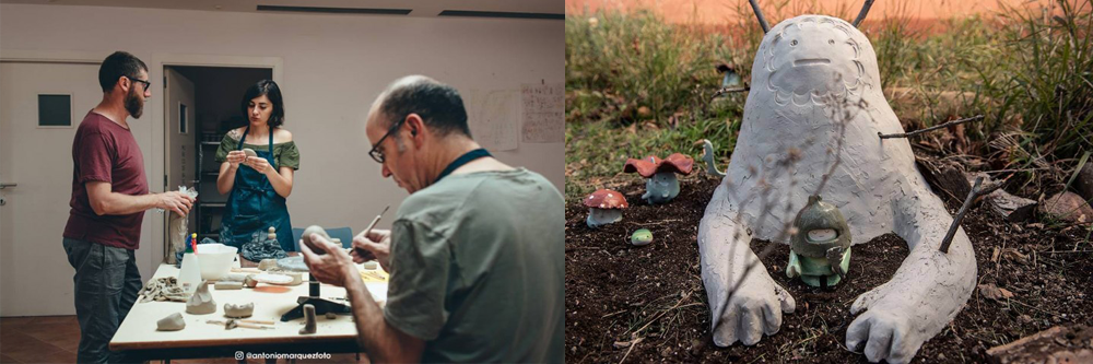
In the early stages, experimentation and contact with materials made the pieces to have a strong, fresh improvisation ingredient, but as the project grew the pieces were more defined by the sketches. As the landscapes for our world took form, the characters were born right away on pencil and paper to live in one of these landscapes. We learnt and improved the ceramic techniques as we created more and more characters. We used different types of clay, porcelains, and enameling techniques.
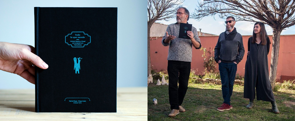
What implies for the project "coming back" to the 2-dimensional world in book form, and having Grassa Toro join the project? What new challenges arose?
The book is the final piece that ends the residence project at Puertas de Castilla and took lots of hours of work, as we thought and designed it to be more of a book-object than just a plain book. We called Grassa Toro because of his extensive experience and publications related to design and illustration. He has worked with great creatives like Isidro Ferrer and Pep Carrió, who we deeply admire.
We had to do photography sessions almost as we were in a theater production, making them a way to illustrate this special book we designed. Grassa Toro wrote the "Fast and Visual Method of Initiation to Wonder" along the title "All that Happens". In this manual of sorts you can find four lessons: Reality, Metamorphosis, Wonder, and Beauty, each one of them with syllabus, questions, practical exercises, and recommended readings.
What did you discover and learn with this project and journey?
We were able to prove that, with passion, you can go very far in your journey. We discovered great professionals and people, who didn't hesitate to play with us. It was a huge project that we could develop from its very beginning. We are very glad with the process and outcomes.
And last, but not least: What can we expect from now on with "Todo lo que sucede" (All that Happens)?
"Todo lo que sucede", the book that we published from Puertas de Castilla on 2018, will continue its journey and we hope more people gets to know it. The expo "All that happens between green and blue" will be on La Cala de Choles, managed by Grassa Toro, until end of March. You can find more info at www.lacala.es
We already began to sell some pieces from the expo and we are working to launch sales again of our "Traveller", the cermic artoy that became the image of our project "Mud Doll". If you want to find more about it, you can visit www.muñecoebarro.com
Thanks, María and Diego!
07 Jan 2019
2019 is here! And as usual, we like to begin this new year in the best way we know: a discount sale! So until 28 February you can have a 30% off discount on your first year of PRO plan.
You don't need to do anything special: the first year of all PRO plans will just cost 52,30$ instead of 74,67$.

For any doubt, question, suggestion or problem, please contact us at uservoice or write us at [email protected].
24 Dec 2018
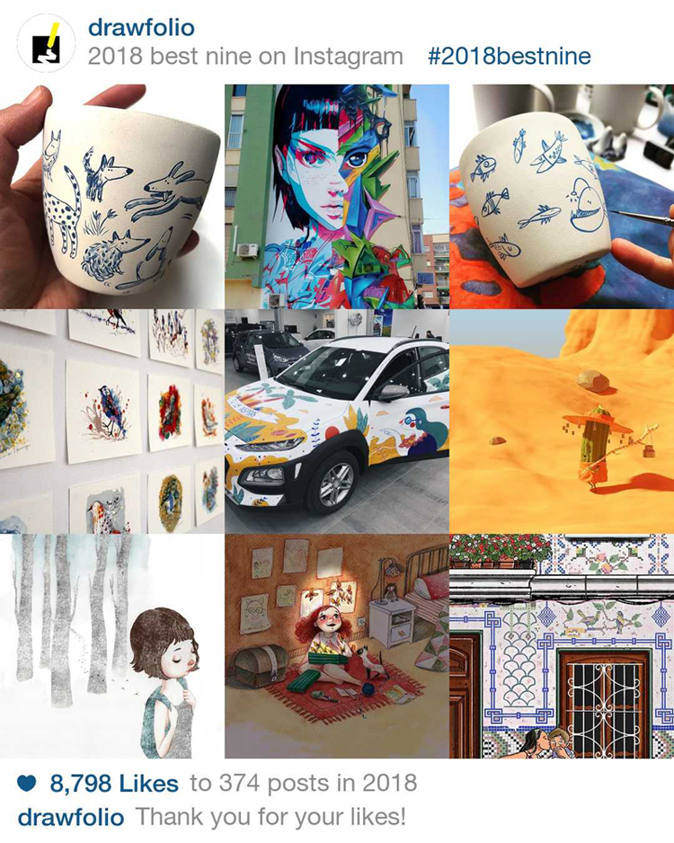
2018 is ending soon, and as we did last year, we can now show you the artists with the most liked pictures and works in Drawfolio in 2018.
As you'll see, most of them are related to the two illustration challenges we organized during this year: the Spanish Free Comic Book Day Challenge and Inktober 2018
As always, you can find out more artists and inspiration in our Discover Artists search engine. If you want more chances of appearing ins posts like this, you can enable Likes in your Drawfolio website.
Also, here are our Instagram best Nine. The artists, from left to right, and top to bottom, are: Caya Gutiérrez, Miedo12, Caya Gutiérrez (again), Draw for Animals, Jotaká, Mike P. Sánchez, Laura Montes,Viktoria Schmidt, y BarracaCrafts.
And that's all for now! All the team at Drawfolio wishes you a Merry Christmas and a Happy New Year :)


